Step 2: System Mapping
System Mapping
Where This Fits
This is the second step of the SiD five-step method (Goals and Indicators, System Mapping, System Understanding, Solutioning and Roadmapping, Evaluate and Iterate). In Step 1 you set your destination. Now you need to see the terrain. System mapping is how you build that picture.
What System Mapping Does
In this step, we analyze the system by charting its objects, constructing the network of relationships between them, and establishing what the system looks like in space, how it behaves in time, and what it affects. From these maps, we can derive insight into possible improved states and solutions.
System mapping is one of the fundamental tools of SiD. It serves three purposes at once: understanding systems, working to improve them, and communicating them to others.
Why Maps?
Mapping has been with us as long as human history. A map is a graphical representation of information. The first world maps changed the course of civilization. System maps do the same thing, except they map more than geography. They map relations in time, movement, and the flow of resources.
When properly executed, a good system map hands you solutions on a plate, simply through the insight it provides. Just as being lost in a city becomes immediately solvable when you pull out a city map, system maps reveal pathways that were invisible before. The same map may suggest different routes depending on different destinations.
People handle large amounts of data better visually than in text. In visual formats, more correlations and insights emerge, and a clearer oversight of complex issues becomes possible. When done right, system maps reveal both root causes and solution pathways. They function as strategic strongholds for years, create unified understanding across teams, enable stakeholder participation, and become powerful planning tools.
System mapping is therefore a worthwhile investment, both as a learning experience for the team and as a strategic asset for the organization.
What Is a System Map?
A system map organizes data from the real world in a way that reveals underlying order or pattern, to determine the nature or behavior of a system. Maps are usually visual, but can also be lists or spreadsheets. System maps rarely come alone. To map a system, you need multiple perspectives and scales, which means making sets of interrelated maps.
Maps exist in three dimensions:
- Space (geographical, physical layout)
- Time (historical trends, cycles, projections)
- Context (relationships, flows, causes and effects)
Examples: A geographical map of a neighborhood's available energy sources is a space-based system map. A graph of the times you enter and leave your house is a time-based map. A flowchart of an organization's legal structure, the causal relationships between a tax policy and a senior citizen's income, or the evolutionary family tree of a badger: all context maps.
A typical SiD system map shows multiple relevant parameters at once. When mapping energy and material flows in relation to economic gains, you represent the information so that new insights emerge, both from the resulting map and from the mapping process itself.
What Makes a Good System Map?
A good system map:
- Reveals important connections or disconnections
- Is readable (not so complex it becomes impenetrable)
- Does not oversimplify reality to the point of being misleading
- Can be easily augmented and adjusted
- Is visually clear and appealing
- Is part of a larger organizing system where multiple maps form a complete overview together
Start with a Sketch
System mapping begins on paper. In the first iterations, work at sketch level to figure out what you are dealing with. In later iterations, find the form and layout that works best. Often, the sketches themselves provide all the insight you need. In some cases, they can be elaborated and redesigned in several steps, with new research in between. In some cases, you advance to computer models or polished illustrations.
Computer visualizations allow dynamic system maps and maps based on large data sets. You can embed the time dimension in space or context maps and watch patterns emerge. The Gapminder project (www.gapminder.org) is an excellent example of dynamically mapping global statistical data across time, space, and context.
For large projects or organizations, specialist tools for big-data analysis or agent-based modeling can be powerful, but they require technical expertise beyond the scope of this guide.
Managing Complexity
The purpose of mapping is never completeness. Complex systems have too many components to map exhaustively. The purpose is to reach an understanding of the system, taking into account as many aspects as possible without being overwhelmed.
We manage complexity by simplifying maps at higher levels of abstraction, making them rougher and less detailed. But here is the critical point: do not simplify by restricting the categories you map. Do not map only energy flows or only economic relations. Make sure you cover all dimensions, scales, and aspects (as covered in the ELSI-8 framework: Energy, Land use, Materials, Ecosystems, Species, Culture, Economy, Health and Happiness).
This is not for the sake of completeness. It is for the sake of range and depth. If you miss important aspects, the solutions you develop later will not create the sustainable state you had in mind.
Limit resolution and depth, not scope.
How to Make a System Map
Getting Started
Mapping usually begins with a diverse team, large sheets of paper, a healthy dose of energy, and plenty of time to explore different approaches. After the initial session, maps may be refined with software, new data researched, graphic layout polished, or mathematical models built to simulate the system.
When facing a new, unmapped system:
- Decide what maps to make
- Map the objects in the system
- Map the relations between those objects
- Look at (and perhaps map) the behavior of the system itself
Understanding may arise simply from mapping the objects and the network. Remember: the process of mapping itself is often what brings insight. Some system maps are illegible to anyone who did not make them, but for those who did, they were the key that unlocked a particular aspect of the system and led to a solution.
Step 1: Determine Subject and Goal
What is the objective of the mapping? Are you making maps to figure out a strategy for improving the system, to find a specific relationship, or to create general awareness? What will you be mapping: a neighborhood, a person, an organization, the influence of a policy decision?
Step 2: Determine What Maps to Make
You will likely make at least three maps, probably more. For them to relate to one another, you need a framework so they speak the same language.
One of the best ways to start is with a map of maps. You need to map in at least three dimensions (space, time, context) and at three scales (small, medium, large). Make a quick grid with two vertical and two horizontal lines, creating nine areas. Fill in each area with the subject and map type you think you can create for your challenge.
Space Maps. We are all familiar with city maps and floor plans. But space can be mapped in many ways. It does not have to be geographical or uniform. Make sure to list maps at different scales: surroundings, city, region, country.
Time Maps. We know these as graphs and timelines. Typical scales include daily, weekly, monthly, yearly, decade, and century. We usually do not map beyond 50 years into the past and future (we are a shortsighted species), but if you do, the results are often fascinating.
Context Maps. These can be the most confusing map type and simultaneously the most powerful. Context maps have no fixed meaning for their axes, so they can show relationships that space and time maps cannot. Simple examples: a shopping list, a budget spreadsheet. More advanced examples: causal loop maps, connectivity diagrams, material and energy flow diagrams. Different scales can represent different levels of connectivity, for example, the chain of connected stakeholders in a supply chain.
For content, use ELSI-8 as a starting point. Fill the categories with areas of interest, gather data, map them individually, and expand from there. ELSI-8 serves as an index to determine what data to map and to ensure a broad spectrum of analysis.
Then consider:
- What type of maps will you use for each dimension? (Causal loop diagrams for context? Agent-relation maps?)
- How many scale steps? (For the time dimension: a 50-year span, or a single day?)
- What subjects or data go on which map? (A basic set of ELSI indicators, an extended set, or a different set of relationships?)
- In what way will you make the maps? (Workshop format, or individual experts creating separate maps and then combining them?)
Step 3: Sketch the Maps and Collect Data
With your map of maps in hand, start sketching. In the first iteration, just see if you can sketch what you want a map to look like. This informs you of what data you need and what insights you expect. Do not dive too deeply into one map. Sketch them all roughly first and work on all areas evenly. You will make more coherent and communicative maps this way.
If certain map types do not work, that is fine. Adjust the framework and repeat until you have maps that serve the goals you set.
Data collection can be time-consuming. To narrow the effort, make sketch maps first, document data needs along the way, and then focus data research on the areas of interest.
Step 4: Select and Refine
After making a range of sketches, select the most interesting ones. See if you can merge maps on the same dimension (for example, combining geographical maps of different subjects or putting information on a single timeline). Research missing information. Redraw.
When you are happy with the framework, map types, and data, finalize all maps. Have a subject-matter expert add details and a designer polish the representation. Involve stakeholders for final evaluation and additional insights.
What Next?
The maps should be revealing opportunities and patterns. If they are not, re-iterate the process and consider setting new goals.
Once you have mapped the current state, you will map the desired state later in the solution cycle. Using the same framework, map the system as you would like it to be: resilient, harmonious, and autonomous (RAH) to the degrees necessary. Use these future projections as discussion points or as tools for finding pathways to improved performance.
Standard Map Types
While there are no official standard maps, the following types play a role in nearly every project:
| Map | Type | Purpose |
|---|---|---|
| Material and Energy Flow Map | Context | Shows major energy and material flows |
| Stakeholder Map | Context | Shows major stakeholders and their relationships to the challenge |
| Organizational Hierarchy | Context | Shows who controls which teams and departments |
| Trend Map | Time | Plots critical societal parameters over time |
| Project Timeline / Route Map | Time | Overview of intended actions toward the goal |
| Programmatic Plan Map | Space | Shows relevant program elements in physical space |
Deeper Map Types
Network Maps
Once you have mapped objects and their relations (bottom-up), a network analysis may be valuable. Network analysis does not concern itself with individual objects. It analyzes the network that emerges from their interrelations.
For example, you can create network maps to analyze specific network parameters: the transparency of information in an organization, connectivity between areas of a city, or the diversity of elements in a system. Network maps give insight into a higher level of a system's operation.
An additional network-level check using the SiD network parameters (such as Connectivity, Redundancy, Awareness, Flexibility, Transparency, Complexity, Centrality, Diversity) can be useful for scanning optimization opportunities.
Causal Loop Diagrams
Causal loop diagrams (CLDs) follow specific rules to investigate and communicate systemic behavior. Elements have relationships drawn between them, indicating whether the effect is positive (+) or negative (-). Reinforcing loops that accelerate behavior are marked with R. Balancing loops that counteract acceleration are marked with B. These maps reveal feedback dynamics that would be invisible in lists or tables.
Mapping Tips
- Use a multi-disciplinary team. Different backgrounds enhance the quality of system maps.
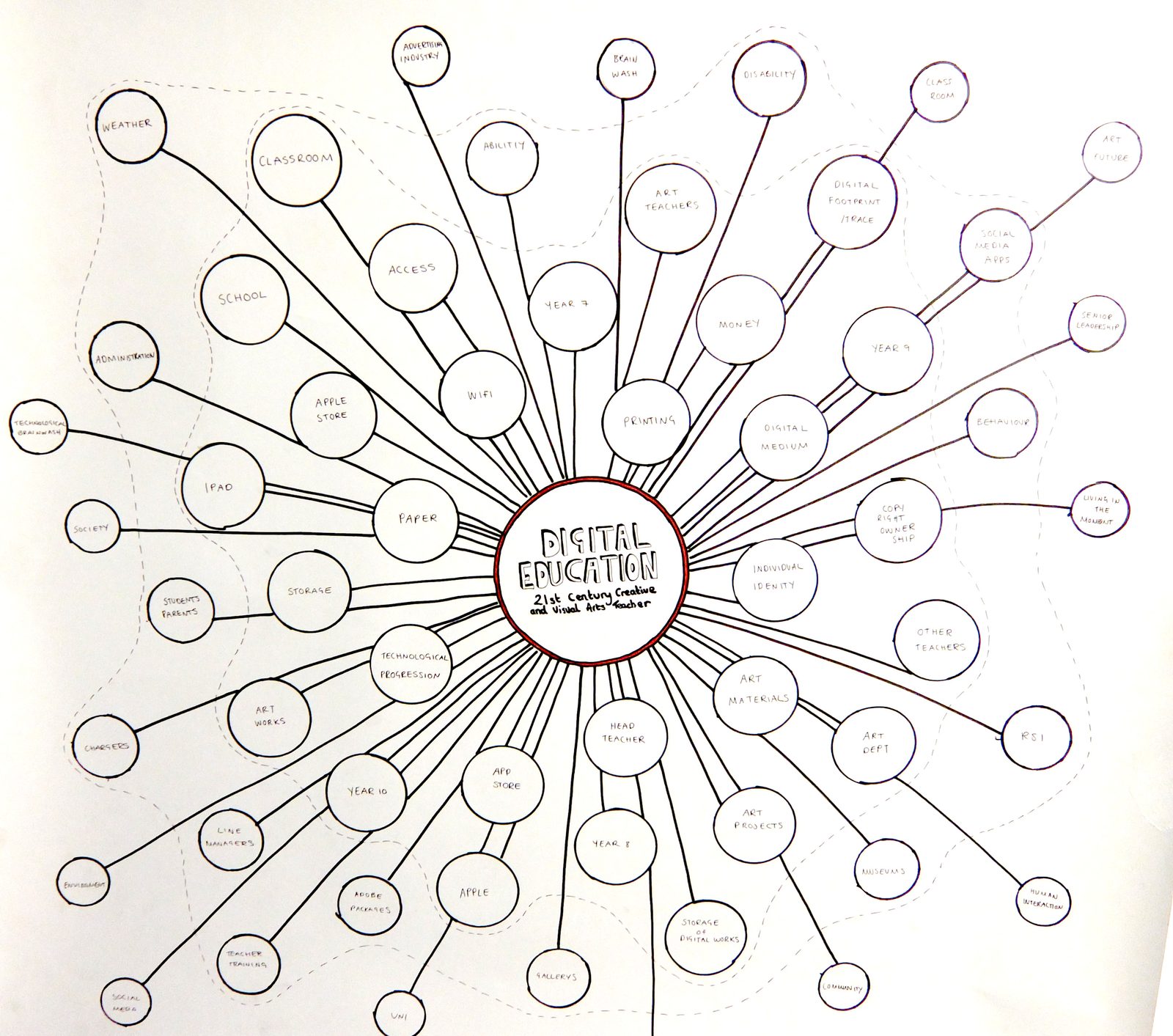
- Ugly is fine. If a sketch provides the necessary insight, it has done its job. Beautiful maps are for communication. Sloppy napkin sketches work if they work.
- System maps are not infographics. Infographics simplify information for display. System maps add insight through an expansive process. They are different skills.
- Experiment freely. You love Excel tables? Go for it. You organize potted plants in your garden to organize your mind? More power to you.
- Do not rush. As a primary tool, system maps deserve time. Let them sink in. Allow time to redraw.
- Account for externalities. You are always excluding things that may have an influence. Acknowledge their existence on each map, even if you cannot quantify them.
System Immersion
System maps create understanding of the system and allow you to develop an integrated view step by step. Mapping the system completely is impossible. The goal is a global overview that allows you to evaluate behavior and search for system-wide solutions.
After familiarizing yourself with all dimensions, scales, and aspects, it is time to immerse yourself in the dynamics and develop a "feeling" for the system's behavior. From this immersion, you can find solutions that shift the existing state to a sustainable state. The next chapter (2.3, System Understanding) describes how to do this, both individually and as a team.
Exercise: One-Hour ELSI/Stakeholder Map
Here is a guided exercise for making a stakeholder system map using the ELSI-8 framework. It can be used to practice or run as a workshop.
A stakeholder map is a visual representation of relationships between parties surrounding an issue. Its purpose: at-a-glance insight into the network of relationships, enabling multi-disciplinary teams to create precise intervention strategies in limited time.
Step 1: Ask the problem owner (5 minutes). List the main stakeholders and their relationship to the project as the problem owner sees them. The source may be biased, but it is a fast starting point.
Step 2: Stakeholder brainstorm (10 minutes). On a flip chart, write down all stakeholders that come to mind. Brainstorm rules apply.
Step 3: ELSI brainstorm (10 minutes). Repeat the brainstorm, but now think of stakeholders in each ELSI-8 category. Draw the eight categories as large squares on a flip chart and place post-its with stakeholder names in each. This "fills out" the stakeholder pool.
Step 4: Prioritize (10 minutes). Underline all stakeholders who are the largest benefactor, problem owner, or influencer.
Step 5: Sketch and choose a map structure (10 minutes). Consider what format serves the problem: a timeline, a geographical map, a spiderweb context-relationship map. Sketch ideas, discuss, and choose.
Step 6: Build the map structure (15 minutes). Execute the chosen structure with post-its on a central sheet. For a context-relationship map, write the project's focus in the center, place primary stakeholders nearby, and group them by relationship type (government, private, business, individuals).
Step 7: Refine (30 minutes). Add secondary stakeholders outward from each primary one. Draw connections. For a supermarket, a primary stakeholder is a supplier. A secondary stakeholder is the supplier's supplier, or their investors.
Step 8: Iterate. Review the map. Is it clear? Is its structure revealing? If not, consider a different map type or reclustering. Each iteration consists of the above steps, some done quickly (do we need more stakeholders?) and some requiring a complete redraw.
Let your creativity loose and experiment. A rubbish map is a useful map, because it shows what does not work. The most important part of system mapping is the process itself, through which you and your team become the masters of the subject.
Takeaway
System mapping is not about drawing pretty pictures. It is about building shared understanding of complex reality. Start rough, iterate, and do not limit your scope. The maps are a means to insight, and the process of making them is often where the real insight happens.
Next: Chapter 2.3 takes you into Step 3, System Understanding, where you move from having maps to truly grasping how the system behaves.
Exercise
Reflect and Apply
- System maps serve three purposes: understanding systems, improving them, and communicating them to others. Think of a system you currently struggle to explain to colleagues or stakeholders. What would a visual map of that system include? What relationships or flows would become visible that are currently invisible in text-based descriptions?
- Choose a challenge you face and sketch a rough system map. Start with the main actors and objects, then draw the relationships and flows between them. What patterns, disconnections, or feedback loops emerge that you did not see before?
- The chapter emphasizes that a good map reveals solutions "on a plate." After creating your sketch, identify one insight or potential intervention point that the map made visible. How would you have found this without the map?
Share your reflections in the exercise submission below to earn 25 points.
Feedback
Community Responses


This knowledge is free because of our supporters. Join them.