Step 2: System Mapping
Step 2: System Mapping
System mapping is the most fundamental tool in SiD. When properly executed, a system map hands you solutions on a plate. It is like turning on the lights in a dark room: instead of fumbling around trying to find where everything is, you can suddenly see the exits, the obstacles, and the opportunities.
When analyzing a system, you deal with enormous amounts of information across many different levels, topics, time scales, and stakeholder perspectives. Graphical representation captures far more data and relationships than text, spreadsheets, or conversation ever could. Maps enable collaborative work across disciplines. They allow you to combine different levels of information to generate insight.
The process of making maps is like the process of turning on the light. Sometimes you do not yet know what the results will be. You have to trust in the process to derive the insight that comes when you finally see the whole picture.
 Three Dimensions of Mapping

Every system can be mapped in three dimensions: space, time, and context.
Space maps show the system geographically. A city map, a floor plan, an energy flow diagram of a neighborhood. But space maps do not need to be uniform, geographical, or top-down. They can show a cross-section, an exploded view, or use creative spatial metaphors. Combine space with time (video, time-lapse) to reveal dynamics invisible at a single point in time.
Time maps show the system's development over its timeline. You know the basic form: a graph with time on the x-axis. But time maps also include video (especially time-lapse and slow motion), roadmaps, Gantt charts, and historical timelines. When mapping time, examine multiple scales: what happens during a day, a week, a year, a decade, 50 years, both past and future. A national healthcare project operates on a 5-to-50-year timeline. A company object might span one year. The scale of your time map should match the scale of your goal.
Context maps show relationships, flows, and hierarchies that exist outside of physical space and time. An organizational hierarchy is a context map: it shows who is responsible for what, without reference to geography. Causal loop diagrams are context maps. Energy and material flow maps, supply chain maps, stakeholder relationship maps: all context. Context maps also have scale. Large scale shows the entire product-service system in rough detail (like a world map). Small scale zooms into one organization's internal operations with high detail.
The Nine-Cell Grid
Combining three dimensions with three scales gives you a 3x3 matrix: nine different mapping perspectives.
| Small Scale | Medium Scale | Large Scale | |
|---|---|---|---|
| Space | Individual building | City and environment | Global perspective |
| Time | One day | One year | 50 years |
| Context | 1st degree (internal) | 2nd degree (+ suppliers) | 3rd degree (full lifecycle) |
You do not need to make a separate map for each cell. Many maps combine multiple cells. The grid is a rule of thumb to ensure coverage. When working in a team, different members can take responsibility for different cells, then come together to exchange findings.
 Types of Maps
Mapping has been done throughout the ages in many forms. In systems analysis, the range of useful maps extends well beyond geographic cartography:
- Energy and material flow maps. Show how energy, materials, waste, water, and food flow through a system. Used in nearly every project.
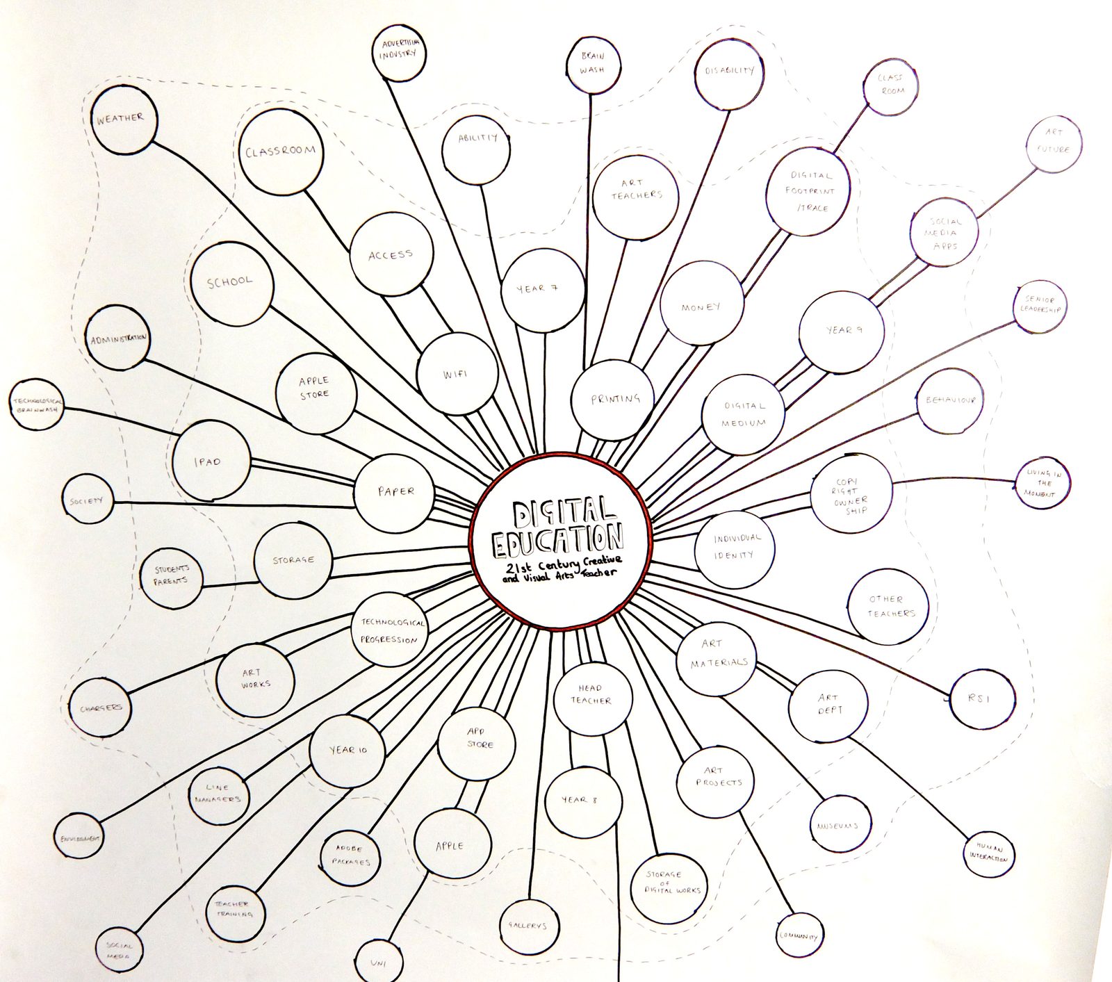
- Stakeholder maps. Context maps showing relationships between actors: supply chains, value networks, influence diagrams.
- Organizational maps. Hierarchies showing responsibility structures, team compositions, product ownership.
- Trend maps. How values, metrics, or areas of interest change over time. Graphs, image sequences, or other temporal representations.
- Roadmaps. Timeline-based maps that capture solutions and their sequencing. These are also a form of system map.
- Programmatic maps. Functions, value streams, business models (such as the Business Model Canvas), and stakeholder-program relationships.
- Causal loop diagrams. Show how different variables in the system influence each other, forming feedback loops.
- Sankey diagrams. Proportional flow diagrams ideal for resource metabolism, energy flows, or supply chains.
The Practical Process
Start by making a "map of maps": a meta-map that shows which maps you need to create. Use the ELSI stack as a guide. Walk through its categories (environment, logistics, social, information) and ask: what would a map of this look like for my system?
Then start sketching individual maps. The critical rule: do not spend too long on any single map. Spend 5 to 10 minutes on one, 20 minutes on another. Develop several in parallel. This prevents getting trapped in one perspective and ensures you look at the system from multiple angles.
When mapping a house in its neighborhood, for instance, start with energy relationships: electricity, heat, gas. Then materials: water, wastewater, food, household goods. Then biodiversity: birds, plants, insects. Within 10 minutes you have an index map showing a house in relationship to its key objects. From there, you can explore how those elements connect, what subsystems exist, and what the system looks like from a 24-hour perspective versus a 50-year perspective.
During the mapping process, data gaps become obvious. You will need the building's energy bill, its material flows, stakeholder contact information. Write these down, but do not stop mapping to collect data. Separate the mapping process from data collection. Once you have a list of needed data, share it with colleagues, request it from stakeholders, organize it, and then plan another mapping session using the new data.
Related Reading
- Read more: System Mapping
← Step 1: Goals and Indicators · Step 3: System Understanding →


This knowledge is free because of our supporters. Join them.